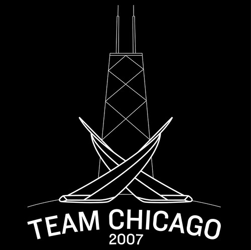
got the t-shirt
Before starting landscape architecture school in the fall, I thought it would be a nice change of pace to coach sailing in Chicago this summer.
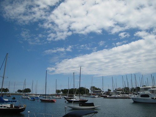 Belmont Harbor.
Even though the whole plan was to avoid design work for a few months, I couldn't help but get excited when my boss offered $100 to the instructor that designed the best sailing school t-shirt.
Living in Chicago for the first time in 7 years, I've found that the Hancock Center has supplanted the Sears Tower as the city's favorite skyscraper. I decided to incorporate the tapered tower into my t-shirt design.
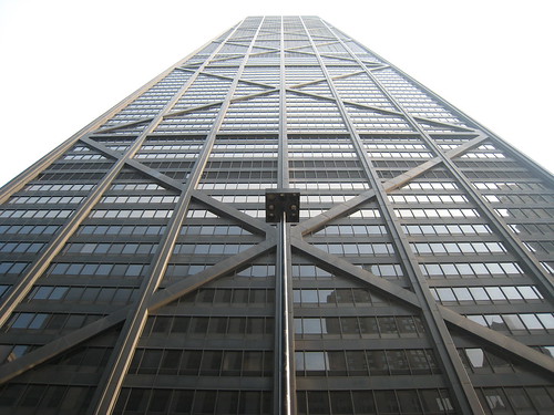 The Hancock Tower.
Pondering the iconic building's distinctive cross-bracing, I couldn't help but think of one of my favorite sights in sailing: two boats crossing tacks upwind. After some online searching, I was able to find a great piece of graphic design from the 1987 America's Cup.
 Duel, by Keith Reynolds. (From AllPosters)
Initially, I thought that the graphic would be a bit sparse with only one tower, so I decided to incorporate two other iconic Chicago buildings.
 The Sears Tower. (From LensImpressions)
 The Smurfit-Stone Building. (From ChicagoSage)
When I finished the design, however, I thought it was a bit busy.
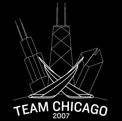
I took out the Sears Tower and the Smurfit-Stone, but I'm not sure it's better. Which one do you like?
We'll see what the other instructors come up with...
Belmont Harbor.Even though the whole plan was to avoid design work for a few months, I couldn't help but get excited when my boss offered $100 to the instructor that designed the best sailing school t-shirt.
Living in Chicago for the first time in 7 years, I've found that the Hancock Center has supplanted the Sears Tower as the city's favorite skyscraper. I decided to incorporate the tapered tower into my t-shirt design.
The Hancock Tower.Pondering the iconic building's distinctive cross-bracing, I couldn't help but think of one of my favorite sights in sailing: two boats crossing tacks upwind. After some online searching, I was able to find a great piece of graphic design from the 1987 America's Cup.
Duel, by Keith Reynolds. (From AllPosters)Initially, I thought that the graphic would be a bit sparse with only one tower, so I decided to incorporate two other iconic Chicago buildings.
The Sears Tower. (From LensImpressions)The Smurfit-Stone Building. (From ChicagoSage)When I finished the design, however, I thought it was a bit busy.
I took out the Sears Tower and the Smurfit-Stone, but I'm not sure it's better. Which one do you like?
We'll see what the other instructors come up with...

19 comments:
I am a fan of the second one, myself. Less is more, right? ;-)
Also: welcome back to Chicago.
I am also a fan of the second one. What about throwing a seagull up there somewhere??
I'm a fan of the second one as well. Is there a way you could incorporate the Dan Ryan in there? Sorry, I just like saying "the Dan Ryan."
I think the first is a bit busy, but the second also looks a bit sparse. I'm with jd.. how about a seagull?
Your images are out of this world, they're great.
Anthony
I prefer the second~ the first kinda looks as though there is an earthquake happening...someone else mentioned a seagull; you might try putting three (an odd number) in a cluster where one of the side buildings would have been (think *movement*). Good luck--I know it will be beautiful.
KISS = "Keep It Simple, Stanley" clearly it is the second simpler one.
How about mod'ing the first one so the buildings are along a straight line, (i.e. getting rid of the curve to avoid the 'earthquake' effect) That way you get more of a Chicago skyline effect.
iltxcD actually, that's brilliant. Thank you. I'm going to pass that on to a couple of people.
Please write anything else!
Post a Comment